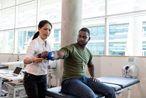
Keep it Simple.

Power Point
Guidelines

Preparation is the difference between a compelling, memorable presentation and one that puts its audience to sleep. The following considerations should help you to build a quality branded presentation.

01

Outline Presentation

Outline
Presentation

Do's

  • Communicate messages clearly and concisely
  • Demonstrate business and industry knowledge
  • Design and organize presentations to convey a clear message with a distinct storyline
  • Showcase company strengths
  • The presentation is a written, visual aid meant to guide, engage and inform. It should not spell out the story verbatim nor be read to your audiences. The presenter’s job is to tell a compelling story
  • Use graphics to strengthen the story

Don'ts

  • Present exhaustive financial analysis without a clear message
  • Repeat pages at different sections of a presentation

02

Utilize Templates

Utilize
Templates

In the PPT master, the templates are broken down into the following sections:

  • Title
  • Division
  • Visual + Text
  • Text Only
  • Chart
  • Closing

Templates Overview

this does not show all templates available

Title

Should be used to introduce a presentation, including presentation title, client, dates or key topics. It should be brief and to the point.

Division

Should be used to break up the presentation into key topics. It will help keep your audience engaged and focusing on the key messaging.

Visual + Text

Should be used to house the main content of the presentation. Make sure visuals tie into your messaging and keep text minimal.

If a template has visuals that are not needed, please delete the visual elements thatdon't fit the narrative.

All master slides can be edited and manipulated, but the marketing team should approve all changes. The goal of the templates is to keep presentations consistent and retain the brand standards. If you are looking for a specific graphic or need help building a slide, contact Michael Traylor at michael_traylor@onecallcm.com.

If you are searching for latest template, look no further:

Download PPT Template

Quick
Tips

  • When copy and pasting into the template, the text will not format automatically. You will need to click the clipboard with the drop-down and click - keep source formatting.
  • Font sizing will auto-scale within text boxes but do not use fonts smaller than 12 pt.
  • Bullets will format by clicking the tab key.

03

Maintain Brand Standards

Maintain Brand
Standards

These standards are guidelines for the colors, photography and icons, logo specs, fonts and messaging that comprise our brand. They’re the glue that holds our brand together and helps create and protect One Call’s brand identity.

Colors

The brand colors are located within the document theme colors. If you are working on more specialized elements, the RGB and hex values should be used:

Primary

RGB:  115 46 140
#732E8C

RGB:  90 87 92
#5A575C

Secondary

RGB:  210 212 212
#D2D4D4

RGB:  126 128 128
#7E8080

RGB:  68 67 71
#444347

RGB:  46 49 51
#2E3133

Tertiary

RGB:  238 118 34
#EE7622

It is okay to use the hues of the new brand colors in charts or infographics where additional colors are needed. These colors are located in the color drop-down within PPT. Reference image showed above.
Photography

Photography plays a significant role within One Call brand communications. It is how the world sees the beautiful and complex work created when we provide intelligent care to the injured worker. Our photography should emphasize the big idea of “Intelligent Care at Work.”

When collateral specifically calls for forward-facing photography, follow the guidelines on how to incorporate the imagery. Please contact michael_traylor@onecallcm.com to access all approved and purchased photography.
iconography

A custom family of icons was developed for use enterprise-wide. The brand colors can be used to add a pop of color to the icons. Gray is also used to create contrast. Their stroke weight can not change and must scale accordingly.

Brand-aid Carepath Data Dental Diagnostics Equipment Devices
Home Health Complex Care Joint Pain Medical Treatment Money Savings MRI Physical Therapy
Rehabilitation Spine Time Translator Transportation Translate Workplace Wellbing
Fonts

All fonts within the PPT document must be Arial. The templates utilize all capitals and various sizes to help add more visual interest. Some examples are shown below:

04

Best Practices

Best PPT
Practices

Do's

Mix it up - present in a variety of ways
  • Charts
  • Graphics
  • Shapes
  • Tables
Title slides

Always include the name of the presentation, the date and the venue on the Title Slide.

General slide rules
  • Make your slides easy to follow. Phrases should read left to right and top to bottom.
  • Limit bulleted text.
Seven-by-seven rule

Your slides should have no more than seven lines of text, with each line having no more than seven words. This keeps your text slides visually clean and appealing. More importantly, it keeps the audience’s attention focused on you, not on the slide.

If a template has visuals that are not needed, please delete the visual elements that don't fit the narrative.

05

Check and Review

Check and
Review

If you have questions or concerns contact Michael Traylor at michael_traylor@onecallcm.com for further graphics direction.